
In the vast and intricate world of mathematics, visualization is often the key to profound understanding. Complex equations, abstract functions, and data relationships can seem daunting on paper, but when rendered visually, they reveal patterns, behaviors, and insights that might otherwise remain hidden. This is precisely where Graph steps in – an exceptionally powerful yet user-friendly open-source application designed to transform mathematical concepts into vivid, interactive graphical representations within a coordinate system. Developed by Padowan, this free Windows program (version 4.4.24.3 at its latest update in May 2023) has garnered significant acclaim, boasting over 100,000 downloads and a dedicated user base across multiple languages.
Graph is not merely a drawing tool; it is a comprehensive utility for students, educators, engineers, and anyone requiring precise mathematical graphing and analysis. Its core strength lies in making the often-abstract world of functions tangible, enabling users to easily visualize, analyze, and even perform various mathematical calculations directly on the graphs. Beyond its robust graphing capabilities, Graph distinguishes itself through its seamless interoperability, allowing users to integrate their mathematical creations into other documents and applications with remarkable ease. Whether for academic assignments, professional reports, or personal exploration, Graph provides an accessible and feature-rich environment for delving into the beauty and logic of mathematics.
Unveiling the Power of Mathematical Visualization
At the heart of Graph’s utility is its exceptional ability to render a diverse range of mathematical functions, providing an intuitive window into their behavior. The program offers unparalleled flexibility in how functions are defined and displayed, making it an indispensable tool for anyone engaged with mathematics.
Drawing Diverse Function Types
Graph provides robust support for drawing three primary types of functions, catering to a wide array of mathematical expressions:
-
Normal Functions (y = f(x)): These are the most common type, where the dependent variable ‘y’ is expressed as a direct function of the independent variable ‘x’. Graph makes it incredibly straightforward to input expressions for functions like
y = x^2,y = sin(x), ory = e^(-x^2). The software instantly translates these algebraic expressions into their corresponding curves on the coordinate plane, allowing for immediate visual feedback. This direct mapping helps users understand how changes in the equation affect the shape and position of the graph. -
Parameter Functions (x = f(t), y = g(t)): For more complex curves that cannot be easily described as a single y=f(x) relationship, parameter functions are essential. Here, both ‘x’ and ‘y’ coordinates are defined in terms of a third variable, typically ’t’ (a parameter). Graph expertly handles these, enabling the visualization of intricate paths such as spirals, cycloids, or Lissajous figures. This feature is particularly valuable in physics, engineering, and advanced calculus, where motion and complex trajectories are often described parametrically.
-
Polar Functions (r = f(θ)): Polar coordinates offer an alternative system for describing points in a plane using a distance from the origin (‘r’) and an angle from a reference direction (‘θ’). Graph’s capability to draw polar functions allows for the elegant representation of shapes like cardioids, roses, and lemniscates. This is crucial for applications in fields like signal processing, antenna design, and celestial mechanics, where radial symmetry is prevalent.
Beyond the fundamental function types, Graph incorporates a rich library of built-in mathematical functions. Users can effortlessly integrate common trigonometric functions like sin, cos, tan, and their inverses, as well as logarithmic functions (log, ln), exponential functions (exp), absolute values (abs), and more. This extensive collection saves time and ensures accuracy, as users don’t need to define these fundamental operations from scratch. The program intelligently parses complex expressions, allowing for nested functions and combinations, thus empowering the visualization of highly sophisticated mathematical models.
Comprehensive Graph Customization
Visualization is most effective when it can be tailored to specific needs and preferences. Graph excels in this regard, offering a wealth of customization possibilities that allow users to fine-tune every aspect of their graphs and the coordinate system. This attention to detail ensures that the visual output is not only accurate but also clear, aesthetically pleasing, and fit for purpose, whether it’s for a classroom presentation or a scientific publication.
Users have granular control over the appearance of the graphs themselves. They can specify the color of each function, enabling easy differentiation when multiple functions are plotted on the same system. The width of the lines can be adjusted, making certain graphs stand out or emphasizing particular features. Furthermore, various line styles (solid, dashed, dotted, etc.) are available, adding another layer of visual distinction and clarity, which is especially useful when printing in monochrome or for emphasizing hypothetical vs. observed data.
A crucial feature for analytical precision is the ability to limit graphs to a specific interval. This means a function doesn’t have to be plotted across its entire domain; instead, users can define a start and end point for the ‘x’ or ’t’ or ‘θ’ variable. This is invaluable for focusing on specific regions of interest, analyzing piecewise functions, or ensuring that the graph fits within certain constraints. To further enhance clarity regarding these intervals, Graph offers the option to show circles at the ends of the graph segments, indicating whether the interval is open (empty circle) or closed (filled circle), adhering to standard mathematical notation.
Beyond the functions themselves, the entire coordinate system is highly customizable. Users can personalize fonts for axes labels, titles, and other text elements, ensuring readability and consistency with other documents. A wide palette of colors is available for various elements, including the background, grid lines, and axis lines. The axes style can be adjusted, for example, to display arrows indicating positive direction or to remove them for a cleaner look. Crucially, Graph supports both normal (linear) and logarithmic axes. Logarithmic scales are indispensable for visualizing data that spans several orders of magnitude, making trends and relationships apparent that would be compressed on a linear scale.
The grids that crisscross the coordinate plane can also be extensively configured. Users can control the spacing of major and minor grid lines, their color, and style, providing precise reference points for reading values from the graph. For positioning the axes, Graph offers flexibility: users can enter specific values for their origin or range, or they can dynamically manipulate the view by moving or zooming with the mouse. This interactive control provides a fluid and responsive experience, allowing users to quickly explore different scales and perspectives of their mathematical visualizations. This level of detail in customization transforms a raw plot into a polished, informative, and professional visual aid.
Advanced Analysis and Calculation Capabilities
Graph is far more than a simple plotting utility; it integrates sophisticated analytical and computational tools that empower users to delve deeper into the properties of functions. These features are indispensable for quantitative analysis, problem-solving, and gaining a comprehensive understanding of mathematical relationships.
Precision Function Evaluation and Derivatives
One of Graph’s standout analytical features is its ability to perform function evaluation and derivative calculations with remarkable precision. Given an x-coordinate, the program can instantly compute not only the function’s value (f(x)) but also its first two derivatives (f’(x) and f’’(x)) for any active function. This capability is crucial for understanding rates of change, slopes of tangents, concavity, and points of inflection—fundamental concepts in calculus and applied mathematics. For instance, an engineer might use this to find the velocity and acceleration of a moving object at a specific time, while a mathematician could identify local maxima and minima.
Beyond static evaluation, Graph offers an interactive tracing feature. Users can trace along a function with the mouse, and as the cursor moves, the program dynamically displays the x-coordinate, function value, and derivative values in real-time. This dynamic feedback provides an intuitive way to explore how these values change across the domain of the function, enhancing conceptual understanding.
For more structured data analysis, Graph can fill a table with evaluated function coordinates within a user-specified range. This means users can define a start point, an end point, and an increment for ‘x’, and the program will generate a table containing x-values and their corresponding f(x), f’(x), and f’’(x) values. This tabular data can then be easily copied into another program, such as Microsoft Excel, for further statistical analysis, storage, or inclusion in reports. This seamless data export capability bridges the gap between visualization and quantitative data management, making Graph a versatile tool in a workflow.
Robust Mathematical Calculations
Graph further distinguishes itself by embedding powerful computational tools directly into its interface, allowing users to perform common calculus operations with ease. These features significantly enhance its utility for both educational purposes and practical problem-solving.
The program can accurately calculate the area under a function in a given interval. This is a core concept in integral calculus, vital for applications ranging from calculating work done in physics to determining probabilities in statistics. Users simply define the function and the interval boundaries, and Graph provides the numerical result, often accompanied by a visual shading of the calculated area on the graph itself, reinforcing understanding.
Another valuable calculation is the distance along the curve between two points on the function. This feature helps in understanding arc length, which has applications in geometry, navigation, and engineering design. By selecting two points on a plotted curve, users can instantly obtain the length of the curve segment connecting them, avoiding manual integration or approximation methods.
Furthermore, Graph can show the first derivative of a function directly on the graph. Instead of just displaying the numerical value at a point, it can plot the derivative function itself, providing a visual representation of the rate of change across the entire domain. This is incredibly insightful for understanding how a function’s slope changes and identifying critical points, intervals of increase/decrease, and local extrema.
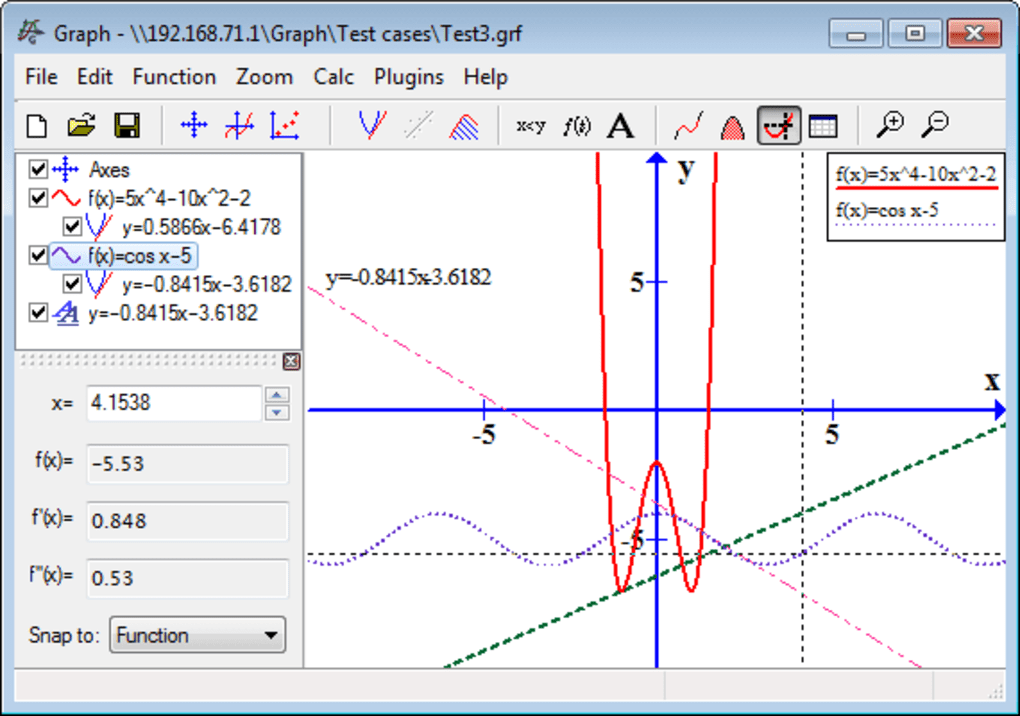
To further aid in understanding instantaneous rates of change, Graph can create tangents and normal lines to a function at given coordinates. A tangent line touches the curve at a single point and has the same slope as the curve at that point, representing the instantaneous rate of change. A normal line is perpendicular to the tangent at that same point. The ability to visualize these lines directly on the graph is immensely beneficial for students learning calculus, allowing them to see the geometric interpretation of derivatives and their applications in optimization and curve analysis. These calculated geometric elements can be displayed with custom styles and colors, making them clear and distinct from the primary function.
Dynamic Point Series and Trendlines
Beyond continuous functions, Graph provides powerful tools for working with discrete data sets through point series and trendlines. This makes it an excellent choice for statistical analysis, experimental data visualization, and modeling real-world phenomena.
Users can create series of points on the coordinate system, each customizable with different markers, colors, and sizes. This flexibility allows for the clear representation of various data sets simultaneously, differentiating between different experimental groups or categories of observations. For instance, an experiment might generate data points that can be plotted with distinct markers to represent different conditions or trials.
A key advantage of Graph is its capability to import data for a point series from other programs, such as Microsoft Excel. This streamlines the workflow for researchers and analysts who collect their data in spreadsheets. Instead of manually entering hundreds or thousands of data points, users can simply import their prepared data, and Graph will automatically plot the series. This efficiency is a major time-saver and reduces the potential for manual data entry errors.
Once a point series is plotted, Graph offers advanced analytical features, including the ability to create a line of best fit (trendline). This statistical tool helps in identifying patterns and relationships within the data, allowing users to approximate the underlying function that best describes the points. Graph provides options for creating trendlines either from one of its built-in models (e.g., linear, polynomial, exponential, logarithmic) or from a user-specified model. The user-specified model option is particularly powerful, as it allows for fitting data to custom theoretical functions, providing flexibility for specialized scientific and engineering analyses. The program calculates the parameters of the best-fit line, often displaying the equation directly on the graph, which is invaluable for predictive modeling and understanding empirical relationships. This combination of data plotting, import, and trendline analysis solidifies Graph’s position as a robust tool for data interpretation and presentation.
Enhanced Presentation and Interoperability
The utility of any graphing software extends beyond its core computational features; its ability to present information clearly and integrate with other tools is equally crucial. Graph excels in this domain, providing functionalities that ensure professional output and seamless collaboration within digital workflows.
Intuitive Shadings and Informative Labels
Effective mathematical visualization often requires more than just lines and curves; it demands contextual information and emphasis on specific areas. Graph addresses this need through its robust features for shadings and labels.
Users can easily insert shadings to mark an area related to a function. This is particularly useful for illustrating concepts like definite integrals (area under a curve), inequalities (regions satisfying certain conditions), or probability distributions. Shadings can be created with different styles and colors within a user-specified interval, offering flexibility to visually differentiate between various regions or highlight critical zones. For example, one could shade the area between two functions to show the difference between their values, or shade a region beyond a certain threshold to indicate outliers. The ability to customize the transparency and pattern of these shadings ensures that they enhance clarity without obscuring the underlying graph.
In addition to the optional legend, which describes each plotted function, Graph allows users to add labels anywhere in the system. These labels are highly versatile and can contain text with different fonts, enabling users to add titles, explanatory notes, or specific annotations directly onto the graph. Crucially, a label can also incorporate images and objects created in other programs. This means users can embed logos, schematics, or supplementary diagrams directly into their graph, transforming it into a self-contained, richly informative visual document. For instance, an engineer could embed a small diagram of a circuit alongside a graph of its electrical response, or a biologist could include an image of a cell next to a growth curve. This rich labeling system makes Graph an excellent tool for creating publication-ready figures and highly informative educational materials.
Seamless Data and Image Export for Professional Output
The ability to easily transfer mathematical visualizations into other applications is paramount for productivity, collaboration, and dissemination of work. Graph is designed with strong interoperability in mind, offering multiple export options that cater to various needs.
Users can save the coordinate system with graphs as an image on disk in several widely recognized formats. The available options include:
- Bitmap (BMP): A standard raster image format, good for general use, though file sizes can be large.
- Portable Network Graphics (PNG): A versatile raster format known for lossless compression and support for transparency, making it ideal for web and digital presentations where image quality is crucial.
- Metafile (EMF): An Enhanced Metafile format, which is a vector-based image format common in Windows applications. EMF files are resolution-independent, meaning they can be scaled without loss of quality, making them perfect for print and high-quality documents where sharp lines and text are required.
Beyond saving to disk, Graph offers a highly convenient feature: the ability to copy the coordinate system directly into another program, such as Microsoft Word. This can be done in two ways:
- As a normal image: This is a straightforward copy-paste operation, embedding a static picture of the graph into the target document. It’s quick and effective for immediate inclusion.
- As an OLE object (Object Linking and Embedding): This is a more advanced and powerful option. When copied as an OLE object, the graph becomes an embedded component within the target document. The significant advantage here is that the graph may be edited later by double-clicking on it. This action re-opens the Graph application (or a miniature version of it) directly within the context of the Word document, allowing users to modify functions, adjust settings, and update the graph without ever leaving Word. This dynamic linking is incredibly valuable for reports and projects that undergo revisions, ensuring that embedded graphs can always be updated to reflect the latest data or analysis without needing to be re-exported and re-inserted manually. This feature alone drastically improves workflow efficiency for document creation involving mathematical content.
Data Import for Comprehensive Analysis
Graph’s utility is further amplified by its robust data import capabilities, which extend beyond just visualizing functions to analyzing raw data sets. This makes it an invaluable tool for empirical studies, scientific research, and any field that relies on quantitative data.
As previously mentioned in the “Point Series and Trendlines” section, Graph allows for the easy import of data for point series from external applications like Microsoft Excel. This is not just a convenience; it’s a critical bridge between data collection/management tools and powerful visualization/analysis software. Researchers often collect large datasets in spreadsheets, and manually plotting these points can be tedious and prone to error. By enabling direct import, Graph significantly streamlines the process:
- Efficiency: Large datasets can be plotted in seconds, freeing up time for analysis rather than manual data entry.
- Accuracy: Reduces human error associated with transcription or manual plotting.
- Integration: Facilitates a coherent workflow where data prepared in one application (e.g., for statistical cleaning or preliminary calculations) can be seamlessly transferred to Graph for visual exploration and advanced fitting.
Once imported, these point series can be subjected to Graph’s analytical features, such as creating lines of best fit, which allows users to derive mathematical models from their empirical data. This seamless data exchange capability reinforces Graph’s role as a versatile and practical tool, empowering users to move fluidly between data preparation, visualization, and sophisticated mathematical analysis.
User Experience, Accessibility, and Community Impact
The success of any software hinges not only on its technical capabilities but also on its usability, accessibility, and the community it fosters. Graph has earned its place as a favored tool due to its balanced approach to these aspects.
Ease of Use Meets Comprehensive Features
One of the most remarkable qualities of Graph is its ability to strike a delicate balance: it is profoundly powerful in its feature set, yet remains remarkably easy to use. The PhanMemFree description aptly notes, “While still easy to use Graph has a lot of customization possibilities.” This duality makes it an ideal tool for a diverse audience. Beginners, such as high school students learning basic functions, will find the interface intuitive for plotting y = x^2 with just a few clicks. The clear layout, straightforward input fields, and immediate visual feedback contribute to a low learning curve.
Simultaneously, advanced users—university students, researchers, and professionals—will discover a depth of functionality that supports complex mathematical exploration. The extensive customization for axes (normal or logarithmic), the ability to plot parameter and polar functions, the precise calculation of derivatives and integrals, and the advanced trendline fitting for point series all cater to sophisticated analytical requirements. The program doesn’t overwhelm with options but makes them readily accessible when needed, allowing users to scale their usage from simple plots to intricate mathematical models. This thoughtful design philosophy ensures that Graph can grow with the user’s mathematical proficiency and analytical needs.
Community and Open Source Advantage
A defining characteristic of Graph is its status as an open-source application. This model of development carries significant advantages:
- Free Accessibility: Being open source means the software is completely free to download and use, removing financial barriers for students, educators, and anyone interested in mathematical graphing. This democratizes access to powerful tools that might otherwise be prohibitively expensive.
- Community-Driven Improvement: Open-source projects often benefit from a community of developers and users who contribute to its evolution. While the primary developer, Padowan, is responsible for the core, the open nature can lead to suggestions, bug reports, and even contributions that enhance the software over time.
- Transparency and Trust: The open-source code allows for transparency, meaning the software can be scrutinized for security vulnerabilities or hidden functionalities, fostering trust among its users. PhanMemFree (formerly Softonic) emphasizes its security status, assuring users that files are scanned and deemed “Clean,” further bolstering confidence in the software’s integrity.
This commitment to the open-source ethos not only provides a high-quality tool at no cost but also fosters a collaborative environment that ensures its continued relevance and reliability.
User Feedback and Continuous Improvement
The development cycle of Graph appears to be responsive to user feedback, a hallmark of effective software. User reviews, such as those featured on PhanMemFree.org (formerly Softonic.com), highlight both its strengths and areas for potential refinement.
One anonymous review from September 2010 lauds the program as “wonderful” and “very good and userfriendly.” The reviewer praises its “A lot of functions,” “Many languages,” and the “Quick, Easy and direct import of the graph” into word processors like Microsoft Word, even noting the real-time effects of moving and zooming. This feedback underscores the program’s core strengths: functionality, multilingual support, and seamless integration.
However, the same review also offers constructive criticism, pinpointing an “increasable point”: the desire for “etichetta” (labels) to include equations in mathematical form (like Equation Editor in Office) rather than textual form. The reviewer notes the “Double entering of the expression (very heavy and dangerous)!” as a drawback, indicating a potential workflow inefficiency where equations have to be re-entered for labels. Suggestions for clarifying function differences (e.g., sqrt vs. sqr) and including examples in the help documentation also point to areas for enhanced user experience. Such detailed feedback from the user community is invaluable for developers like Padowan, guiding future updates and ensuring that Graph evolves to meet the practical needs of its users. The program’s consistent updates, with version 4.4.24.3 being the latest in May 2023, suggest an active development process that likely incorporates such insights, demonstrating a commitment to continuous improvement.
Availability and System Requirements
Graph is readily accessible, primarily designed for the Windows platform, supporting various versions including Windows 2000 and beyond. It is available in multiple languages, including English, German, Spanish, Portuguese, and Chinese, reflecting its global user base. With a compact size of 10.07 MB, it is lightweight and quick to download, making it easy to install even on older systems. The impressive download count of 104.7K (and 27 last month’s downloads as of the reference content) from PhanMemFree.org alone indicates its widespread popularity and reliability as a go-to tool for mathematical graphing. Its availability also extends to other platforms, such as Android, demonstrating the developer’s commitment to broader accessibility.
Conclusion
Graph stands as a testament to the power of open-source software, providing a robust, free, and incredibly versatile solution for mathematical visualization and analysis. From its fundamental ability to plot normal, parametric, and polar functions with high precision to its advanced features for calculating derivatives, integrals, and trendlines, Graph equips users with a comprehensive toolkit for exploring the intricacies of mathematics.
Its strengths lie not only in its extensive feature set but also in its intuitive design, making it accessible to students learning their first algebraic concepts while simultaneously offering the depth required by engineers and scientists. The rich customization options for graphs and axes ensure that visual outputs are always clear, professional, and tailored to specific presentation needs. Furthermore, Graph’s seamless interoperability, particularly its ability to export to various image formats and embed as editable OLE objects in documents like Microsoft Word, significantly enhances productivity and streamlines academic and professional workflows. The direct import of data for point series bridges the gap between raw data and insightful graphical analysis, solidifying its utility for empirical studies.
Ultimately, Graph is more than just a piece of software; it’s a bridge between abstract mathematical theory and tangible understanding. It empowers users to see the patterns, understand the dynamics, and unlock the insights hidden within equations and data. As a continually updated, community-supported, and globally accessible tool, Graph remains an indispensable resource for anyone seeking to visualize, analyze, and communicate mathematical concepts with clarity and precision.
File Information
- License: “Free”
- Latest update: “May 24, 2023”
- Platform: “Windows”
- OS: “Windows 2000”
- Language: “English”
- Downloads: “104.7K”
- Size: “10.07 MB”


